BEFORE & AFTER INTERIORS PORTFOLIO
INTERIOR DESIGN TO FIT YOUR LIFESTYLE
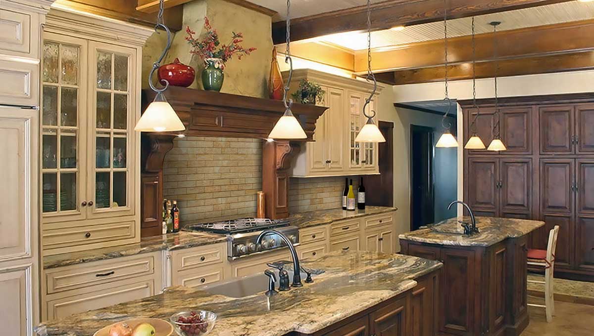
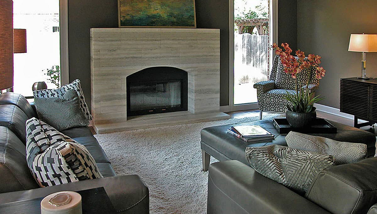
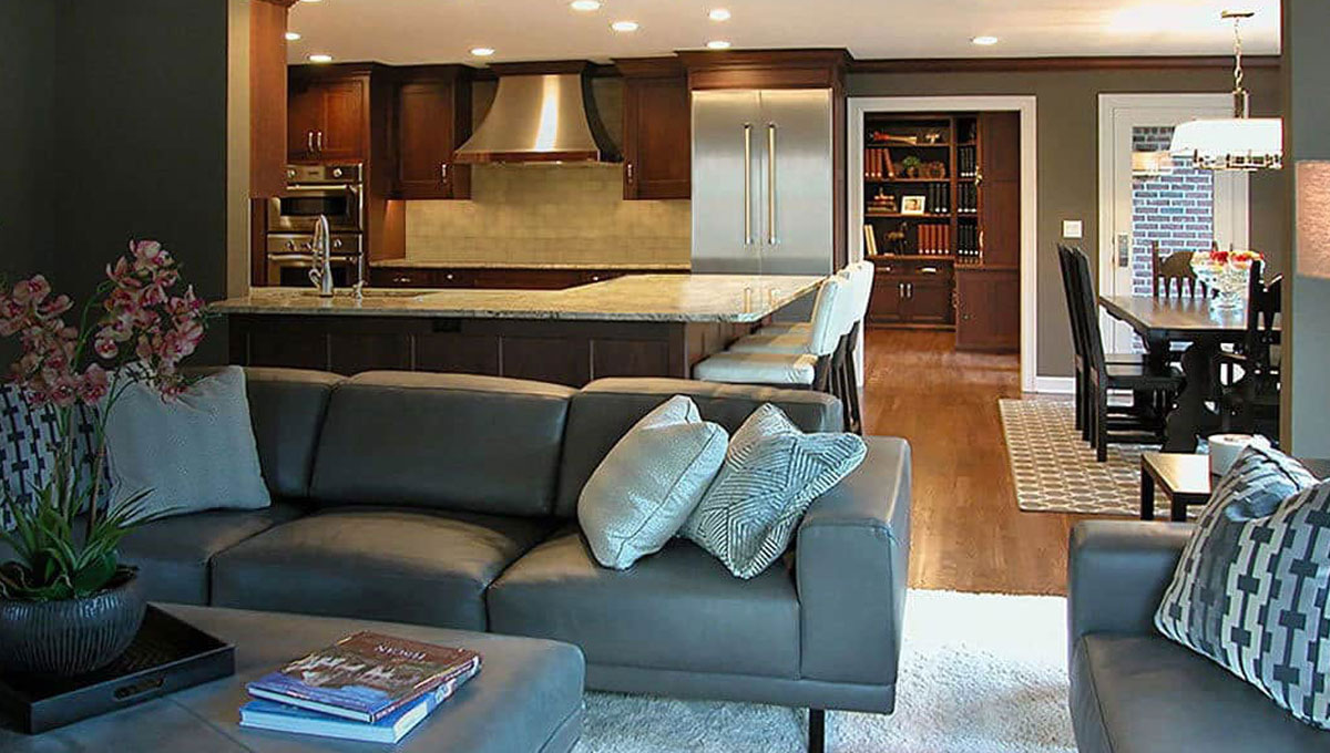
Inspiration for every room. Imagine your home’s interior designed and built to meet your specific needs and lifestyle. We’re here to help turn your unique vision into reality.
BEFORE
AFTER
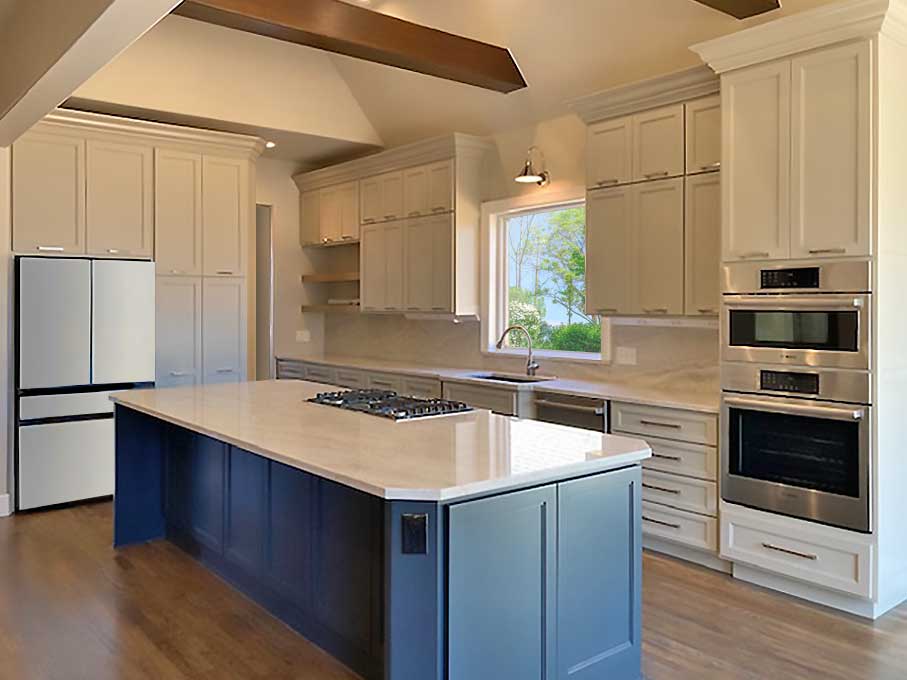
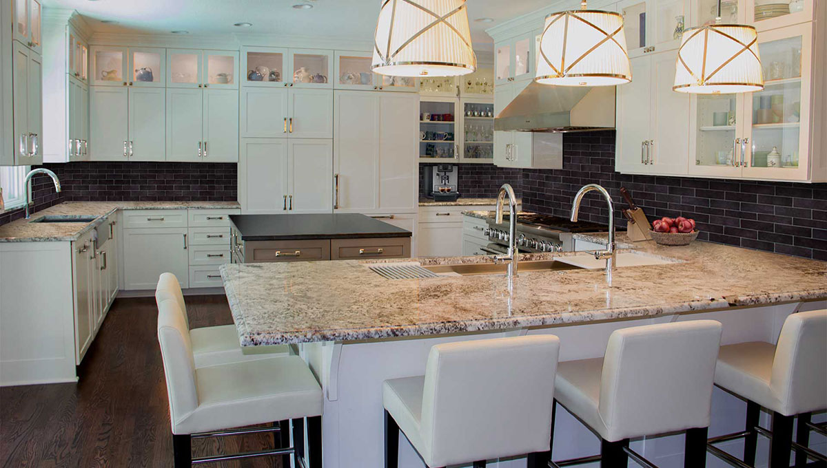
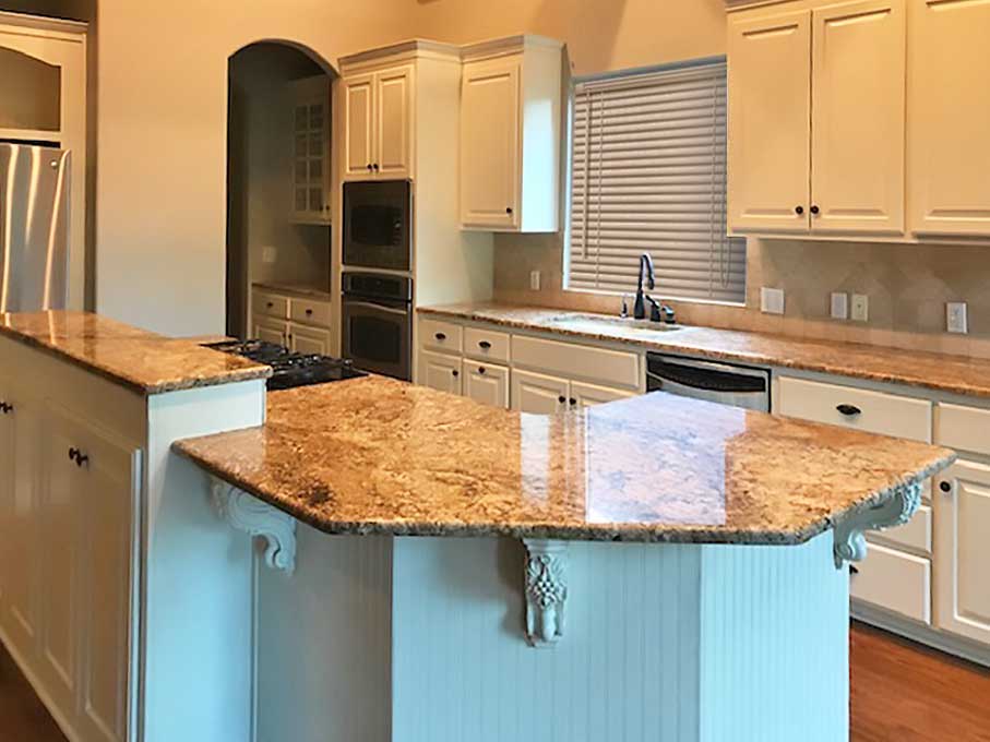
AFTER: BEAUTIFUL MODERN FUNCTIONALITY
Ready for the home chef, this kitchen is perfect for daily meal prepration, family gathering and entertaning guests. Convenience, style and practicality make time spent in this kitchen a true pleasure.
BEFORE
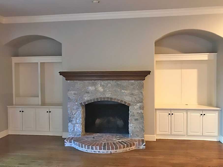
AFTER
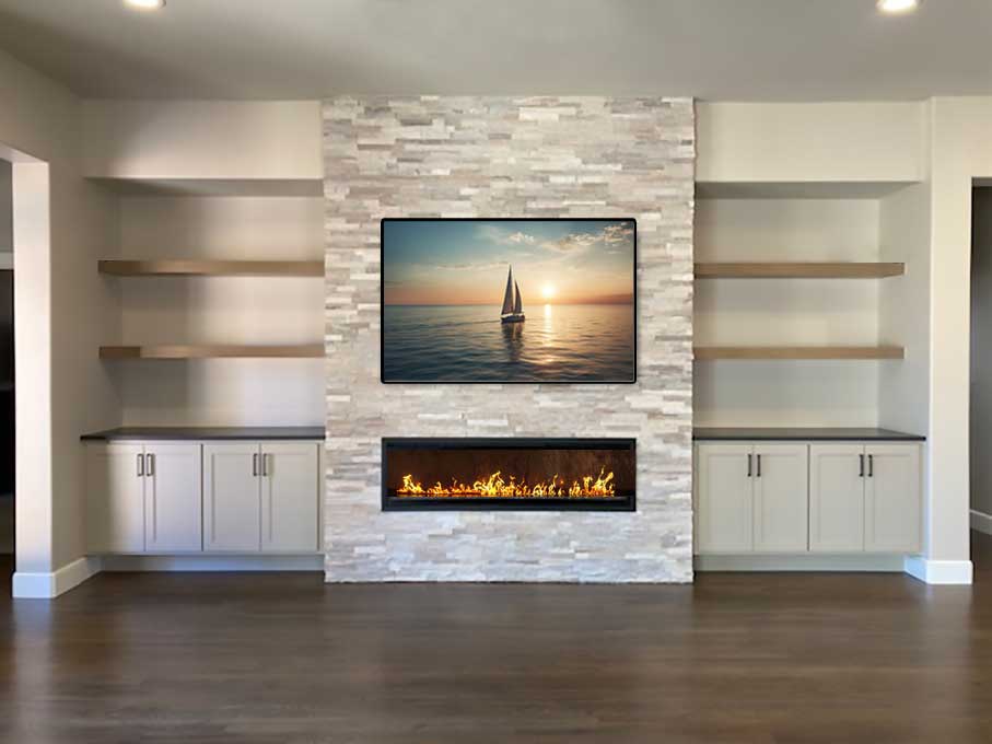
AFTER: STYLE AND BALANCE
Here’s an elegant and cozy setting for all to enjoy! Spatial relationships, color palette, lighting, surfaces and textures bring it home.
BEFORE
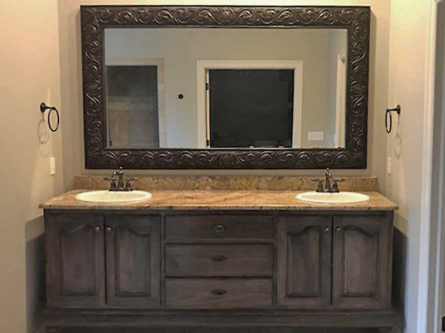
AFTER
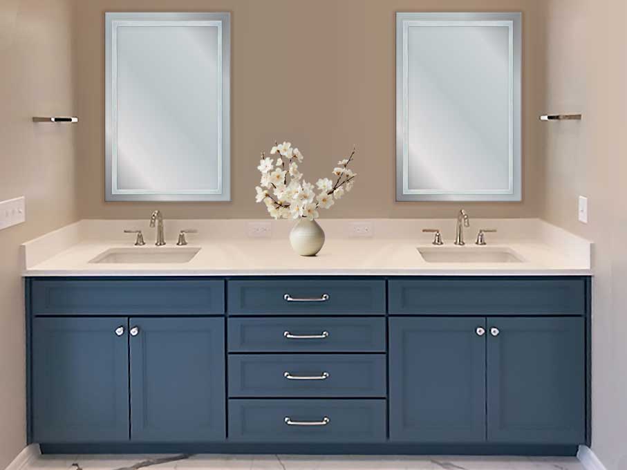
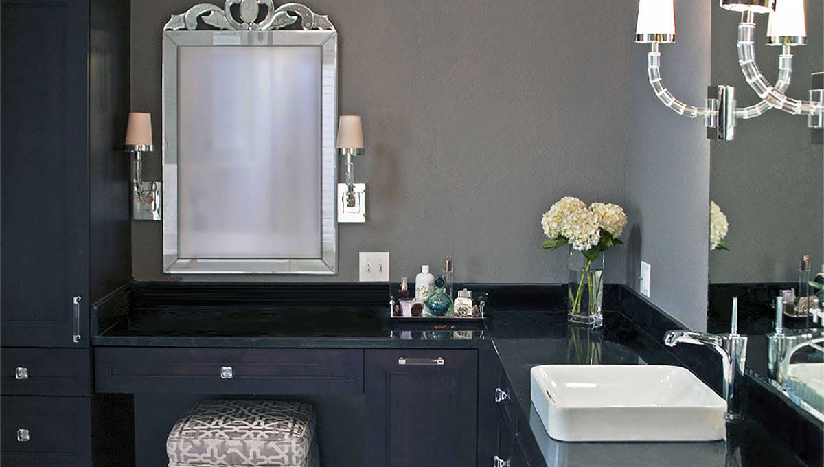
AFTER: CLEAN LINES AND SYMMETRY
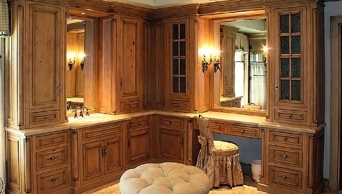
Perfectly proportioned within the space, this vanity presentation is consistent with the overall “reserved elegance” found throughout this newly remodeled home.
BEFORE
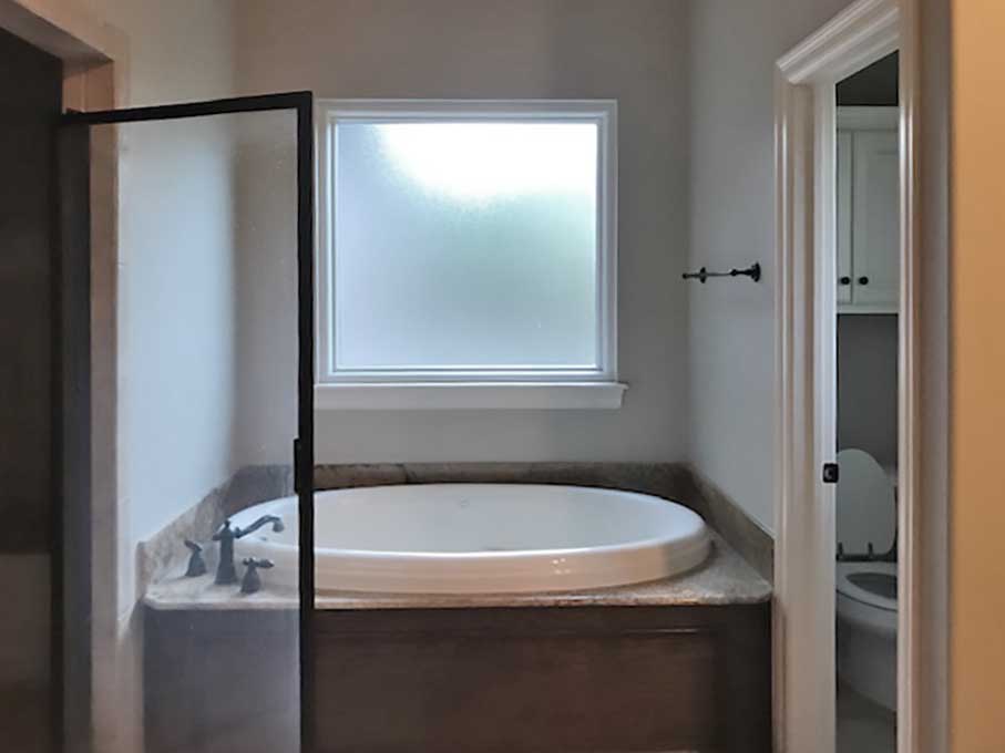
AFTER
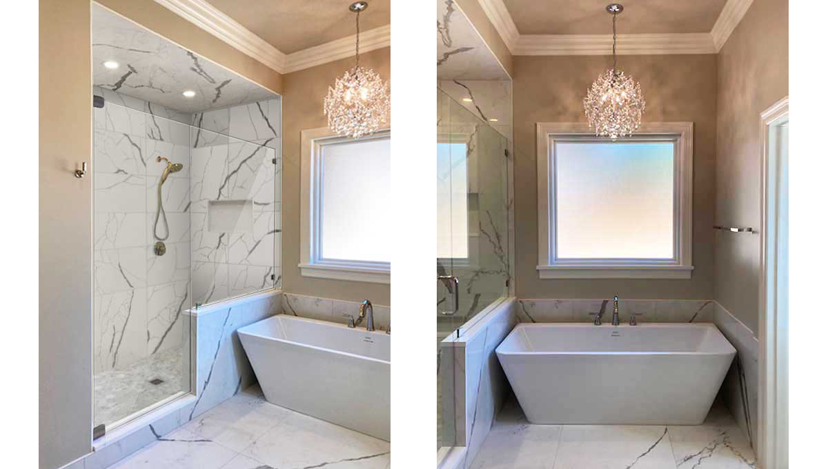
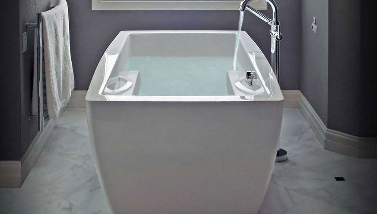
AFTER: LUXURIOUS DEEP SOAKING TUB AND SEPARATE SHOWER
This combination is equipped for an efficient shower or submergence into a rejuvenating bathing experience. Brizo shower plumbing control fixtures are surrounded in easily maintained porcelain. All designed and built by The Buckingham Group.
BEFORE
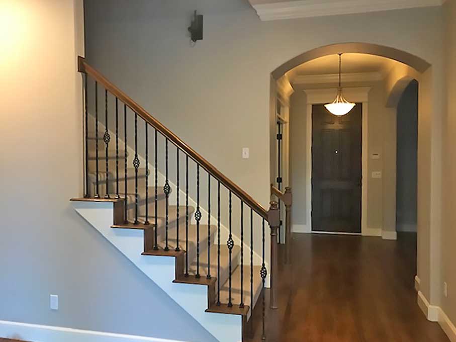
AFTER
AFTER: FRESH AND CONTEMPORARY
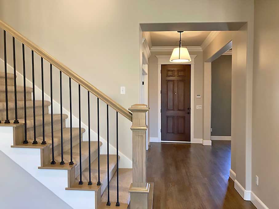
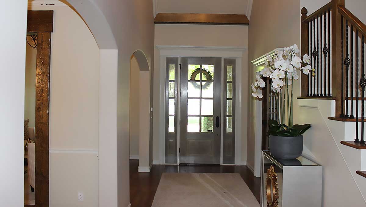
A single pendant casts soft light into this modern entryway. The dramatic stairway features a finely crafted newel post and railing supported by custom solid metal balusters. Subtle contrasting hues extend a warm welcome to family and friends.
BEFORE
BEFORE: A Fairly Standard Entry
A variety of door and trim molding styles along with dated furnishings and accents.
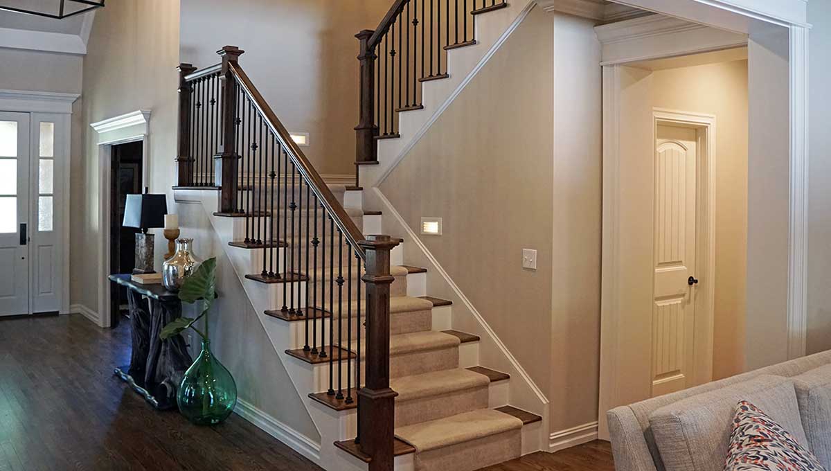
AFTER: A Welcoming Entryway
Continuous wooden floors lead past a dramatic staircase with stylish wooden posts and handrails separated by finely turned metal balusters in black. Steps and risers were partially covered with carpet for noise reduction, safety and good looks. As such, this is the convenient intersection to all areas of the home’s interior.
BEFORE
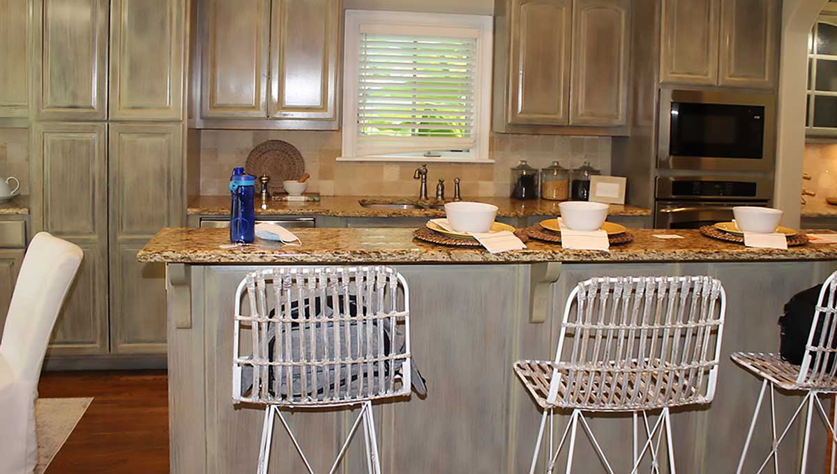
BEFORE: 2008 Styled Kitchen
A solid candidate for updating, this kitchen was a throw back to 2008 including color washed painted cabinets, faux antiqued seating and composite countertops. A low contrast palette, largely in tones of beige, dulled the overall appearance. We knew the right materials and color choices would would make this kitchen a stunner.
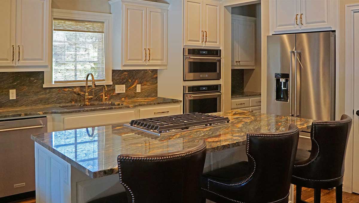
AFTER: A Stunning Modern Kitchen
Dramatic Taj Mahal quartzite countertops share hues with the wooden flooring providing warmth and exciting contrast. The scene is completed with subdued bone colored cabinets, modern appliances and fixtures. Dark brown, tack nailed leather seating completes this cohesive presentation.
BEFORE
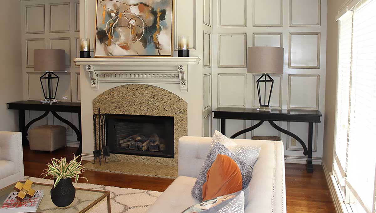
BEFORE: Disjointed Den and Fireplace
A pieced together feel made this living area appear less than sophisticated. An abundance of disjointed shapes and proportions needed attention along with clashing colors and surfaces. We knew just what to do here.
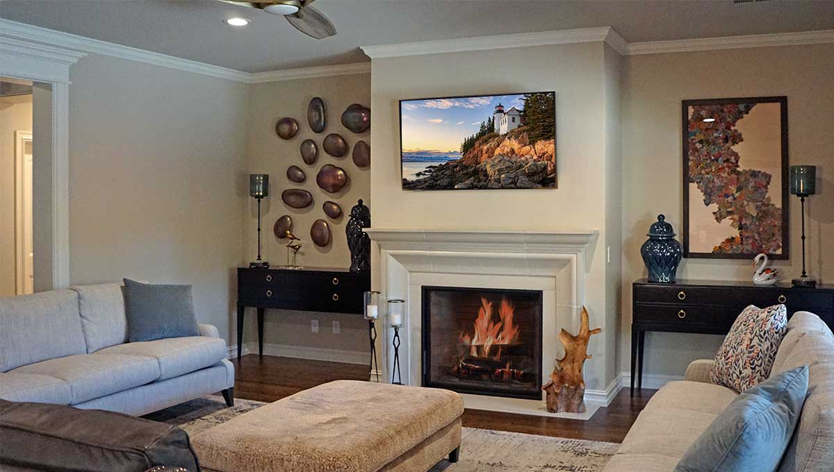
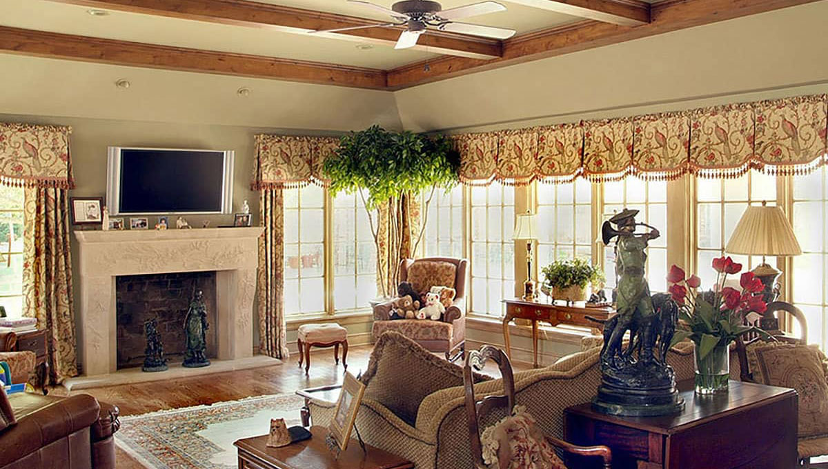
AFTER: A Peaceful Place
Continuity and proportions were keys to making this an inviting living space. And, the cast concrete fireplace mantle by Solus Decor enhances the comfortable atmosphere for all. Conversation, a good book or just watching a film, this is a peaceful place to spend time alone or with family and friends.
BEFORE
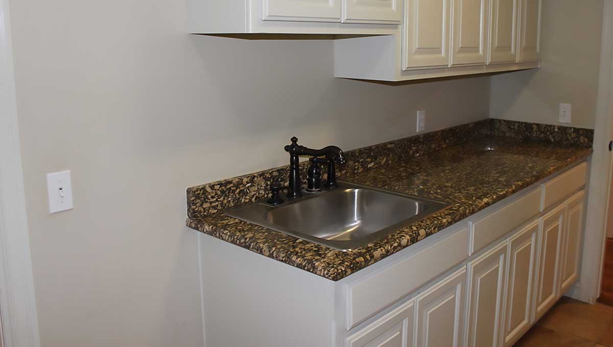
BEFORE: Basic Utility Room
Usable utility room. Just the Basics.
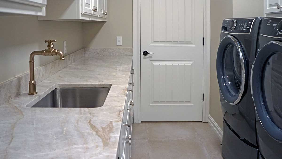
AFTER: High-End Utility and Laundry Room
A Taj Mahal Quartzite countertop with stainless steel sink faces a large capacity front loading washer & dryer set. Cabinets, lower and upper, are clean white as are entry doors and trim. Functionality with fresh style.
Tried and true.
We are unique among Tulsa area remodelers. Read about the comprehensive remodeling experience we have consistently provided for more than forty-two years. You will find our tried and true “best practices” are unmatched.
10 Compelling Reasons to Choose The Buckingham Group ebook Order Form
BEFORE
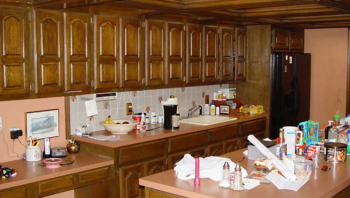
BEFORE: Stuck in the 80’s
The dropped ceiling with an elaborate wood grid, effectively hid the fluorescent light bulbs while lowering the ceiling height to seven feet. The claustrophobic feeling of the low ceiling was amplified by a row of nondescript cabinets. Cathedral shaped cabinet doors and the magenta laminate countertops locked this kitchen firmly in the 80’s.
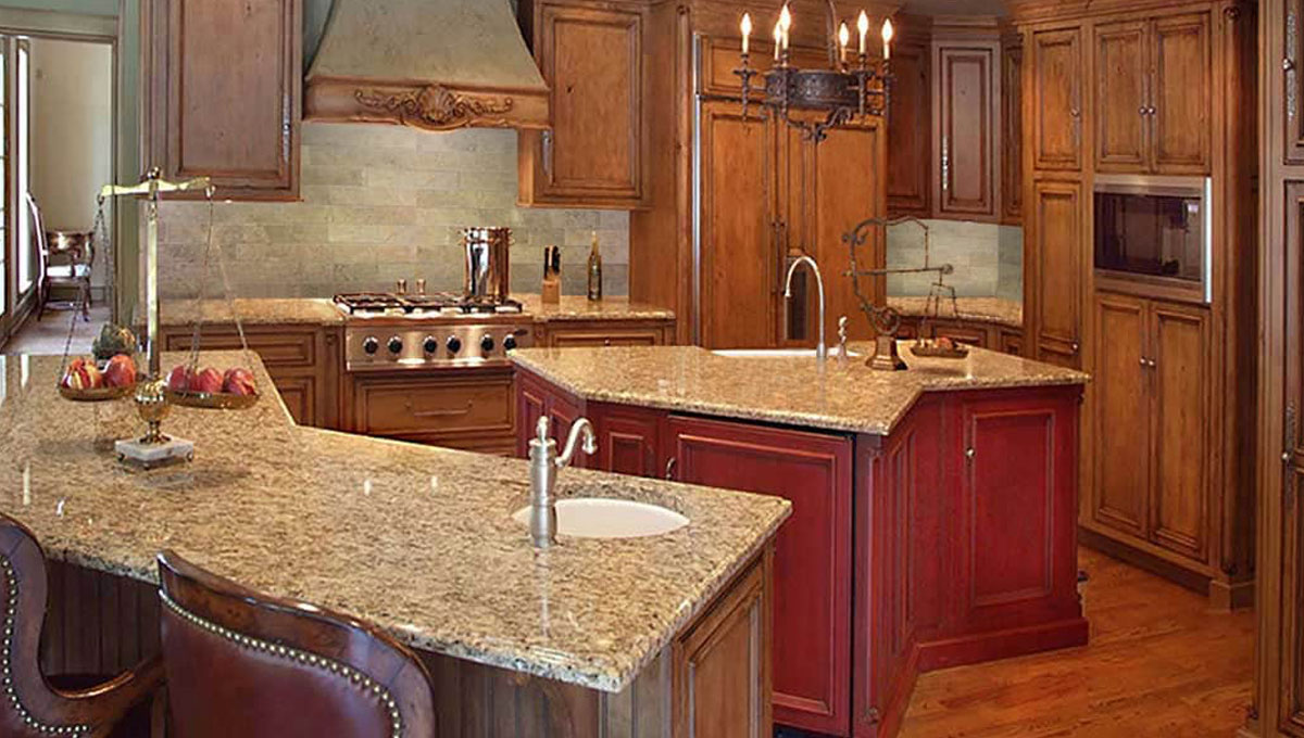
AFTER: Island Living
Twin Knotty Alder Islands provide a unique design solution to spatial requirements in this kitchen. The island in the foreground contains a warming drawer, vegetable sink and eating bar. The second island contains a beverage cooler and main sink. The space between the islands provides a direct path between the Wolf Cooktop and the expansive walk-in pantry.
BEFORE
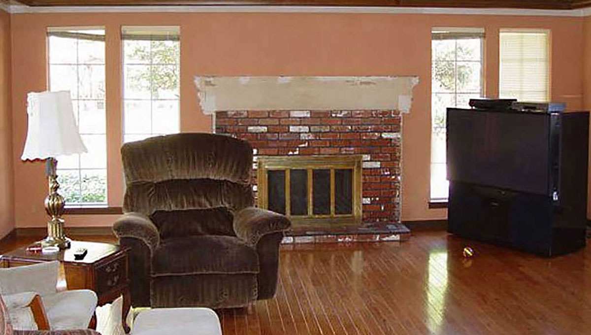
BEFORE: Dreary Days
Decorative box beams were reflected in the high gloss finish of the hardwood floors. A used brick fireplace façade and narrow mill finish aluminum windows effectively blocked the view of the expansive back yard. The eight-foot ceiling height created a cramped feeling in this large family room.
AFTER: Room with a View
The ceiling of the family room was raised to ten feet. A double French Vault ceiling was created and outlined by Knotty Alder decorative beams. A cast stone fireplace created a focal point. An abundance of Pella Architectural Casement Windows with simulated divided lights wrapped around the room now provides an expansive view.
BEFORE
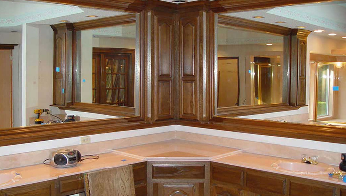
BEFORE: A Beleaguered Bath
Ash cabinets with cultured marble tops wrapped around the corner of this primary bathroom. Framed mirrors reflect a portion of the shower stall which is complete with polished brass framing. A standard eight-foot ceiling, which characterized the 80s look, does not take advantage of the attic space above.
AFTER: French Country Comfort
Knotty Alder cabinets with inset doors from Jay Rambo Cabinets provide an abundance of storage as well as a luxurious bathroom environment for the wife’s vanity. Antique wall scones, custom beveled glass mirrors and a Travertine Marble countertop with a Delta lavatory faucet complete her side. An electrically heated floor adds a hidden source of comfort.
BEFORE
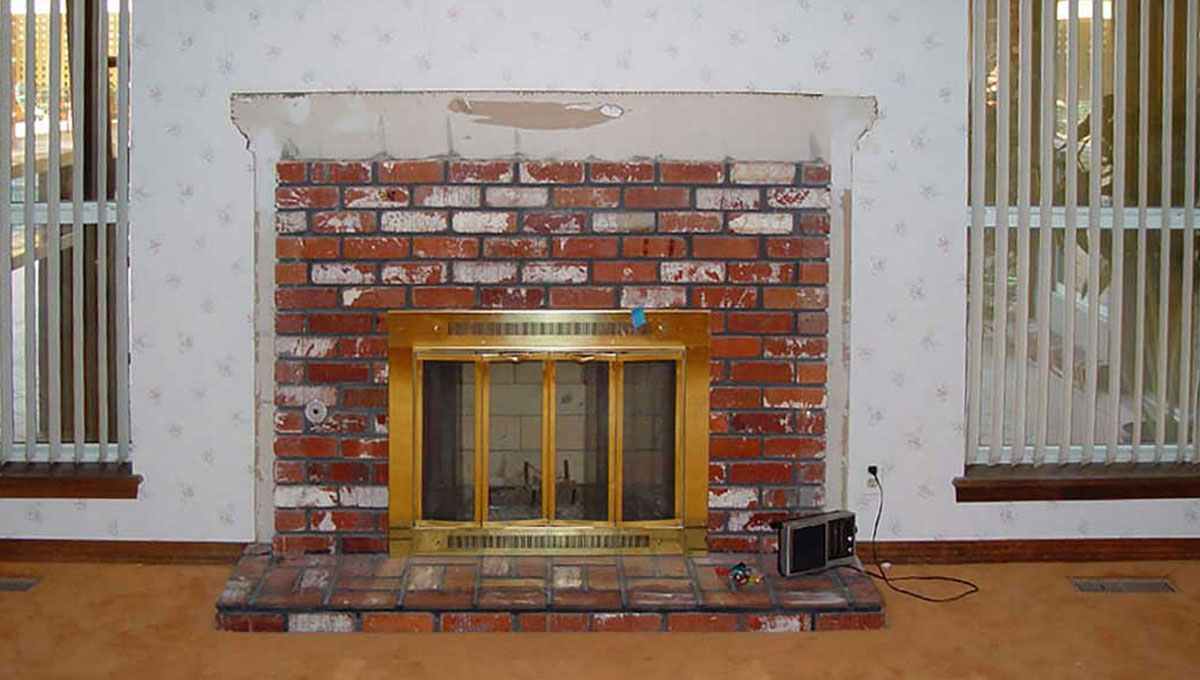
BEFORE: A Blank Canvas
The fireplace was covered with used brick. Complete with polished brass screen and surrounded by twin aluminum windows with vertical blinds it was the dominant and exceptionally ugly focal point in this master bedroom. Worn out carpet covered the floor.
AFTER: A Woman’s Touch
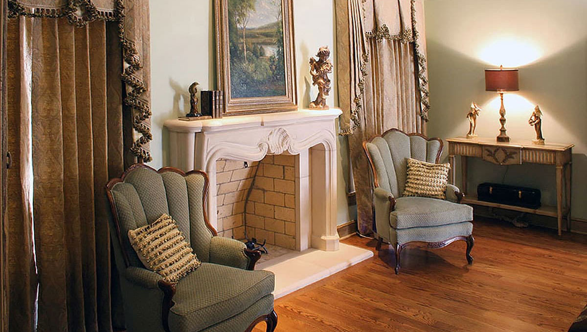
A cast stone fireplace, transformed the fireplace from ugly to beautiful. A double French vault ceiling took advantage of attic space above the room. Oak hardwood floors replaced the carpet. Custom drapes from Leslie Elliot Interiors complement the traditional club chairs.
BEFORE
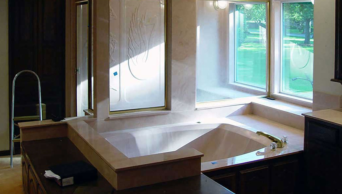
BEFORE: The Swan Song
Typical of the 80’s, this primary bath was a bewildering assembly of cultured marble. A whirlpool tub for two and a large shower complete with six-foot-tall, cultured marble swan along with polished brass fixtures screamed for replacement.
AFTER: Luxurious Lair
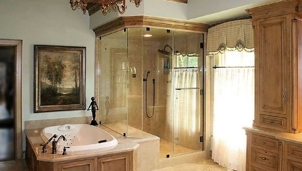
The walls and ceiling of this custom frameless steam shower are covered with Travertine Marble Slabs.A Kohler whirlpool tub with a stimulating array of jets is centered in a custom Knotty Alder tub surround. A double French Vault Ceiling adds a spacious feeling.
BEFORE
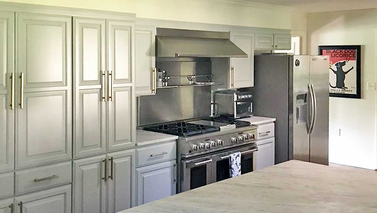
BEFORE: Ranch-style Kitchen
Details often make the difference in home remodeling. Attention to proportions and spatial relationships are a must. Here we found a large scaled refrigerator protruding horizontally into the space. Clearly, bigger is not always better. Extra bold cabinet panels and trim were too heavy in appearance. And, the aging stainless steel was accessorized with a countertop appliance and the built-in wire shelf located on the backsplash. Through it all, we saw great potential in this kitchen.
AFTER
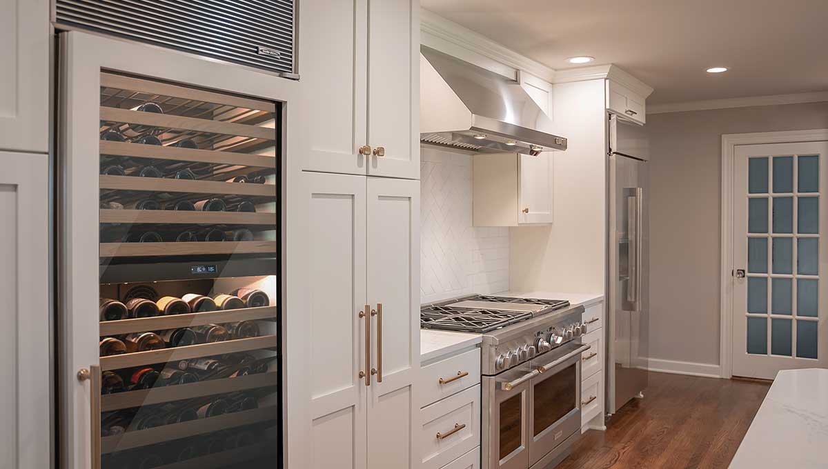
AFTER: Sleek Modern Kitchen
Tucking appliances neatly into the custom cabinetry opens up the workspace and brings clean lines and uninterrupted visual order to the presentation. With that, a modern inviting food preparation and serving area has been created. Now, the subtle contrasts of this soft pallete are apparent and can be enjoyed. Select the perfect wine and enjoy!
BEFORE
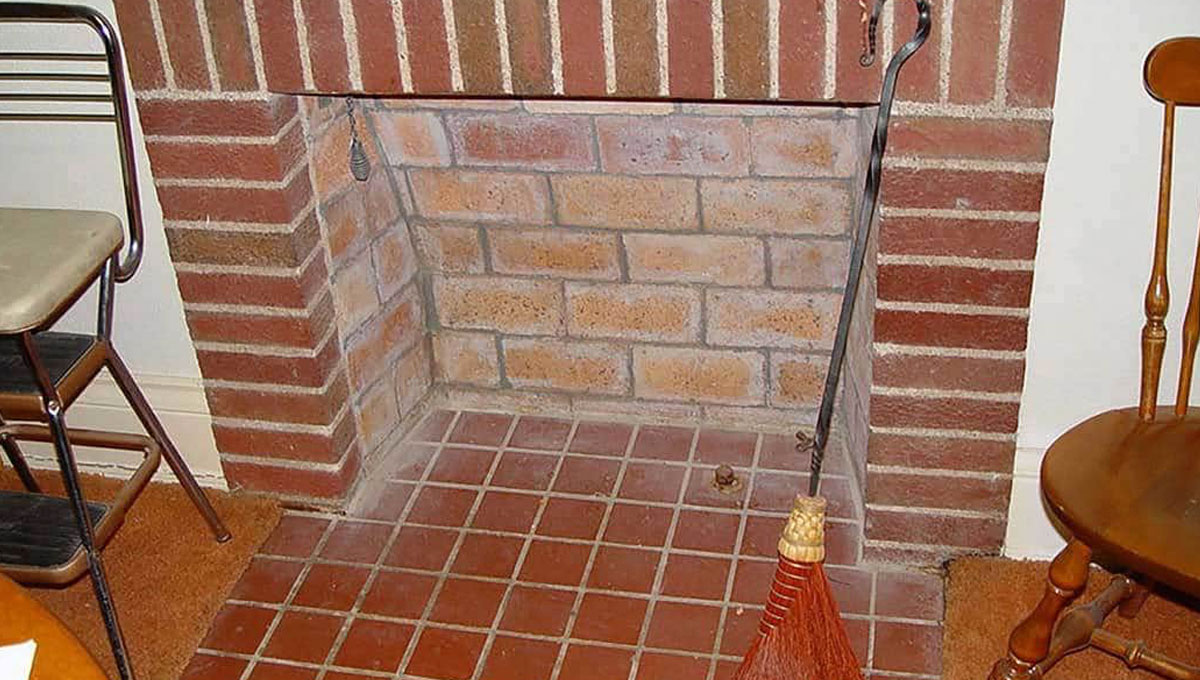
BEFORE: A Neglected Space
The 1500-square foot basement of this 1928 vintage Maple Ridge home had fallen into disrepair. Leaking basement walls had provided all the moisture needed to warp the original hardwood floors. The dark and wet basement created the perfect environment for mold growth which was beginning to permeate the balance of the home.
AFTER: Bring in the Light
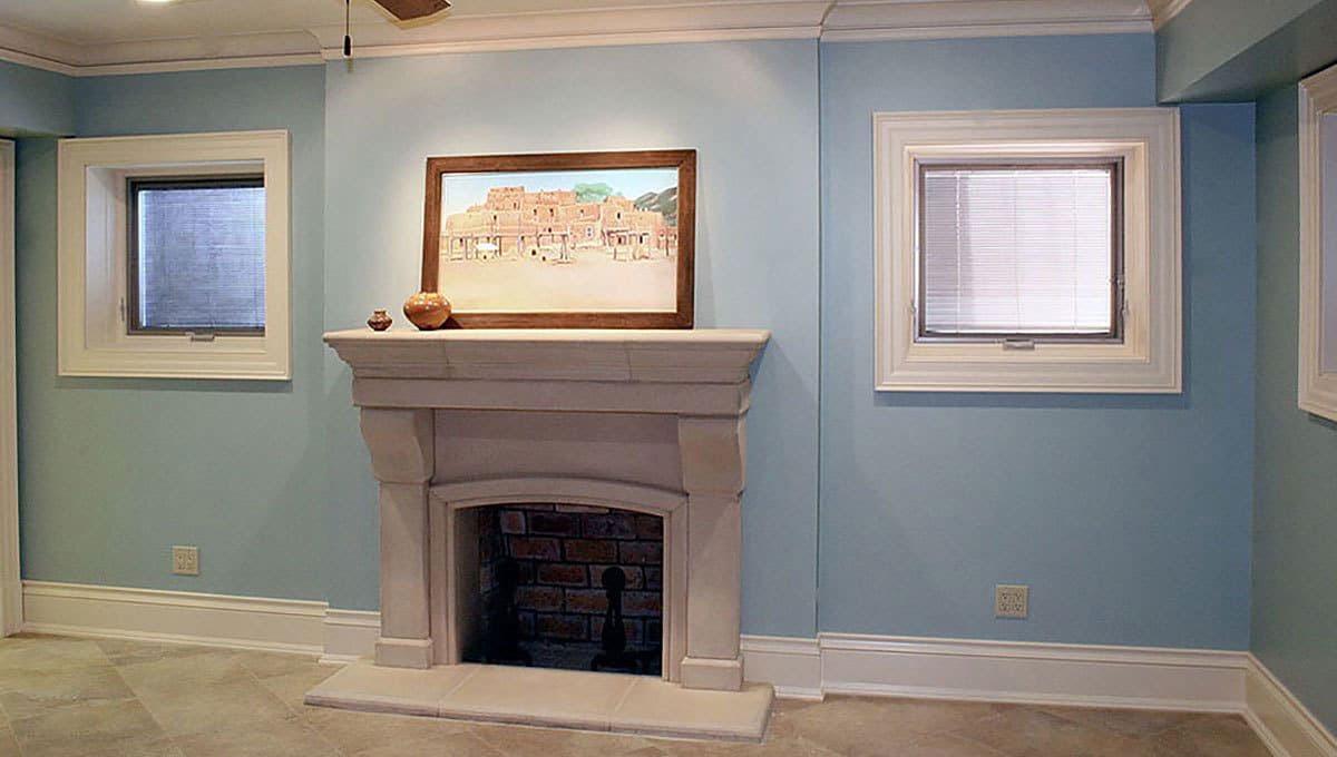
To solve the basement’s water intrusion problems French drains were installed, basement walls were sealed with mastic and the excavation backfilled with a combination of crushed rock and topsoil. Pella Architectural series casement windows were installed along with a cast stone fireplace surround. Matching moldings and a Travertine tile completed the remodel.
BEFORE
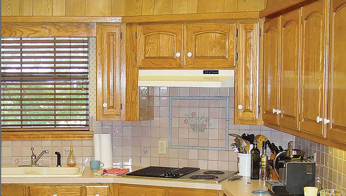
BEFORE: Builder Basic
A dropped ceiling complete with plastic grids hovered over this 1980’s kitchen. Oak cabinets with arched top doors, that had yellowed with age, were tucked under the plywood covered soffit. Laminate countertops provided the foundation for a surface mounted sink, while 4” x 4” ceramic tile covered the backsplash.
AFTER: Preferred Seating
A five-foot Galley Sink centered in an Alaska White Granite Countertop is serviced by two Delta faucets providing the heartbeat of this unique prep and serving center. Custom full overlay cabinets by Broken Arrow Woodworks provide a wealth of storage.
BEFORE
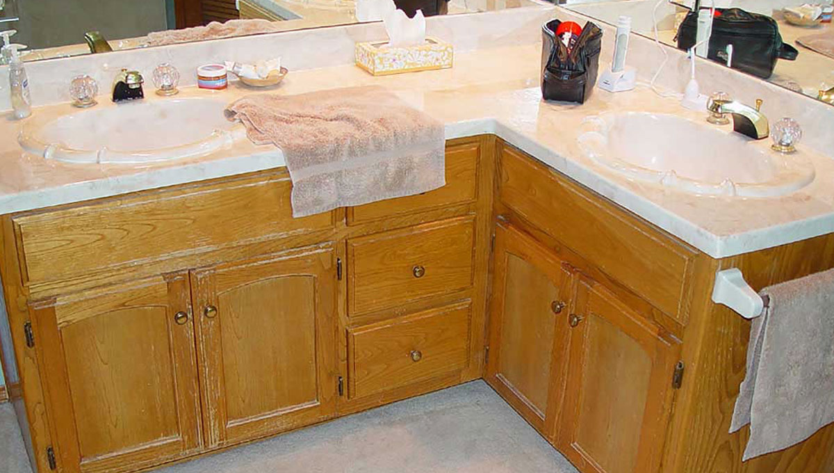
BEFORE: Cornered and Cramped
A vanity with his and hers cultured marble tops were crammed into the corner of this primary bathroom in this south Tulsa home. The yellowed peeling finish on the ash cabinets coupled with polished brass faucets and an impractical floor covering of carpet placed an explanation point on the need for an update.
AFTER: Sophisticated Sanctuary
The layout of the primary bath was totally reconfigured thereby enabling, both the husband and wife to have separate vanities. Brazilian Mahogany (Sapele) cabinets were designed and custom manufactured for this bathroom. Etched glass mirrors and custom wall sconces add both decorative and functional features to the space. A Kohler surface mounted vessel lavatory provides both clean-up-space and a cosmetic center for the wife.
BEFORE
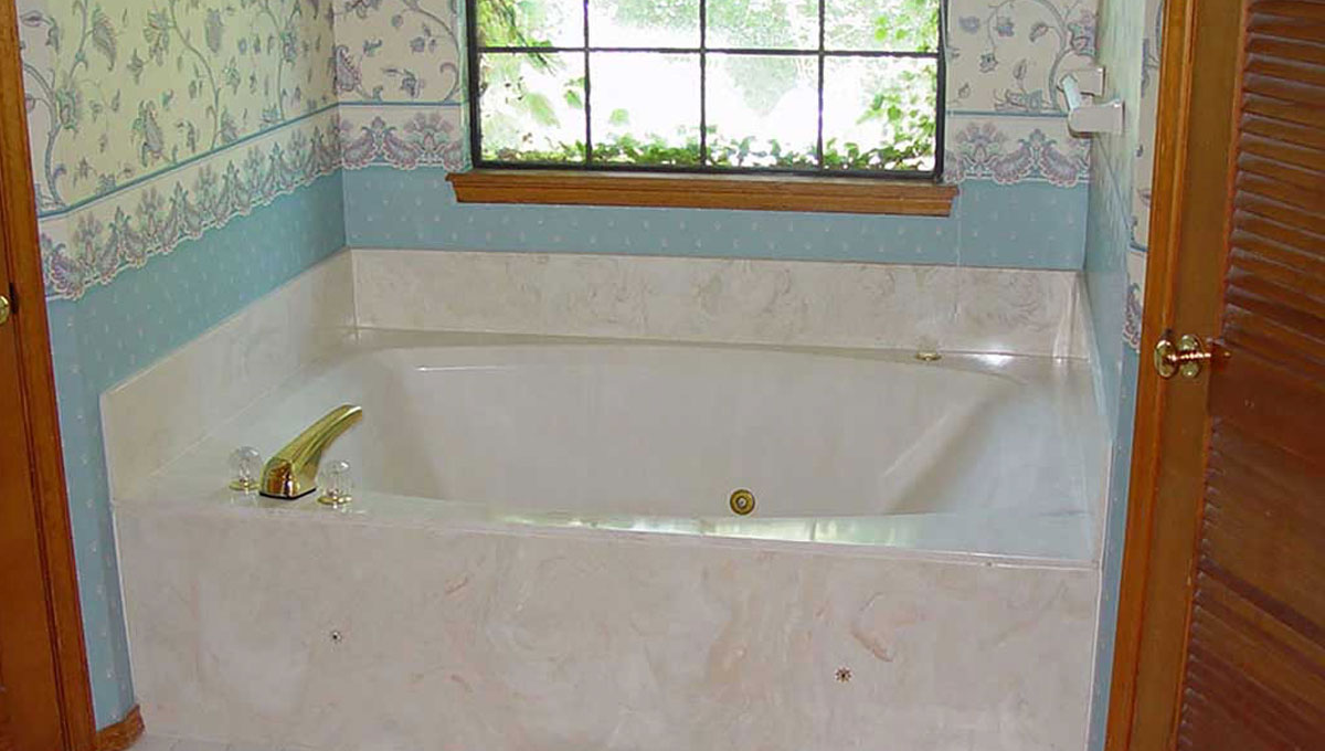
BEFORE: Past its Prime
A mammoth cultured marble tub for two complete with a polished brass tub filler were the focal points as you entered this primary bathroom. Fussy, outdated wallpaper, an aluminum window, carpeted floors, and an abundance of louvered doors created a maze of dated visual effects.
AFTER: The Art of Relaxation
This Bain Ultra air tub is filled with a Kohler floor mounted tub filler. Characterized by its many programable luxury features the user can activate stimulating air jets, Chromo-Therapy lighting and or Vibra Acoustic treatments all while relaxing in the tub. Release your imagination and focus on how you would like to either start or end your day in this master bathroom air tub.
BEFORE
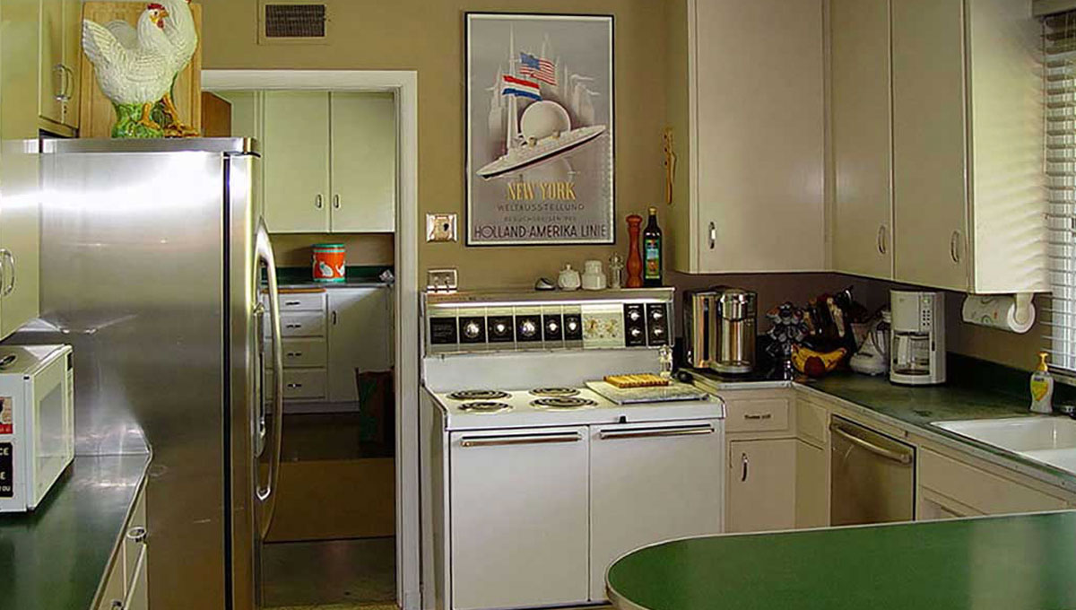
BEFORE: Untapped Potential
Green linoleum countertops, with polished chrome edge treatment along with flat plywood doors and a large electric range locked this home in the 50s.The cased opening lead into an adjoining room which was a giant walk-in pantry where groceries could be delivered from the local high-end grocery.
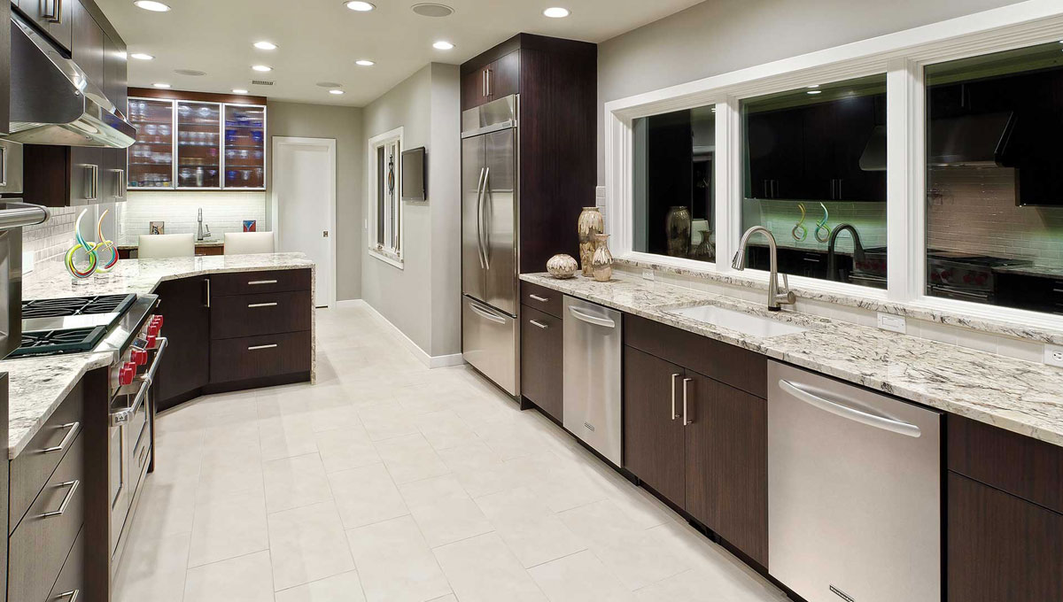
AFTER: Form Meets Function
The wall separating the pantry from the kitchen was removed opening the space into a long and luxurious kitchen. Brazilian Mahogany Euro Style cabinets, twin Bosch dishwashers, a Wolf dual fuel range & exhaust hood and abundant countertop surfaces create the perfect kitchen for entertaining. Three large picture windows light the kitchen and allow a view of the expansive front lawn.
BEFORE
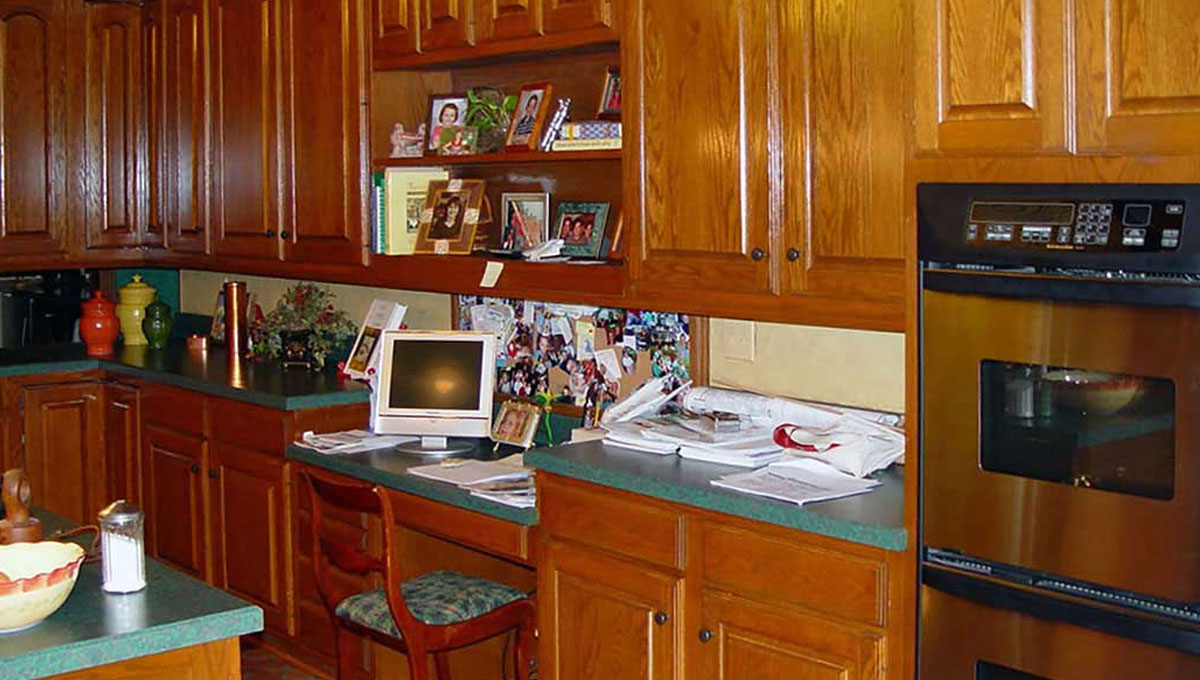
BEFORE: Dysfunctional Design
The dark and dated kitchen was locked in the 80s and in significant need of a 21st century update to boost its floor space, function, and aesthetics. Adding to this major problem were outdated appliances, laminate countertops, an undulating Mexican Tile floor and builder basic seven-foot tall orangey-ash cabinets, which in themselves stuck out as a sore thumb.
AFTER: Custom All the Way
Knotty Alder cabinets provide a functional workspace with African Fantasy granite countertops providing aesthetic appeal. A simulated fireplace mantle hides the exhaust hood which is outfitted with a sound-deadening dampener provided by Fantech of Lenexa, Kansas. Push activated sections on the mantle hide lighting controls and duplex outlets. Cabinets at the end of the kitchen provide his and her hanging space.
BEFORE
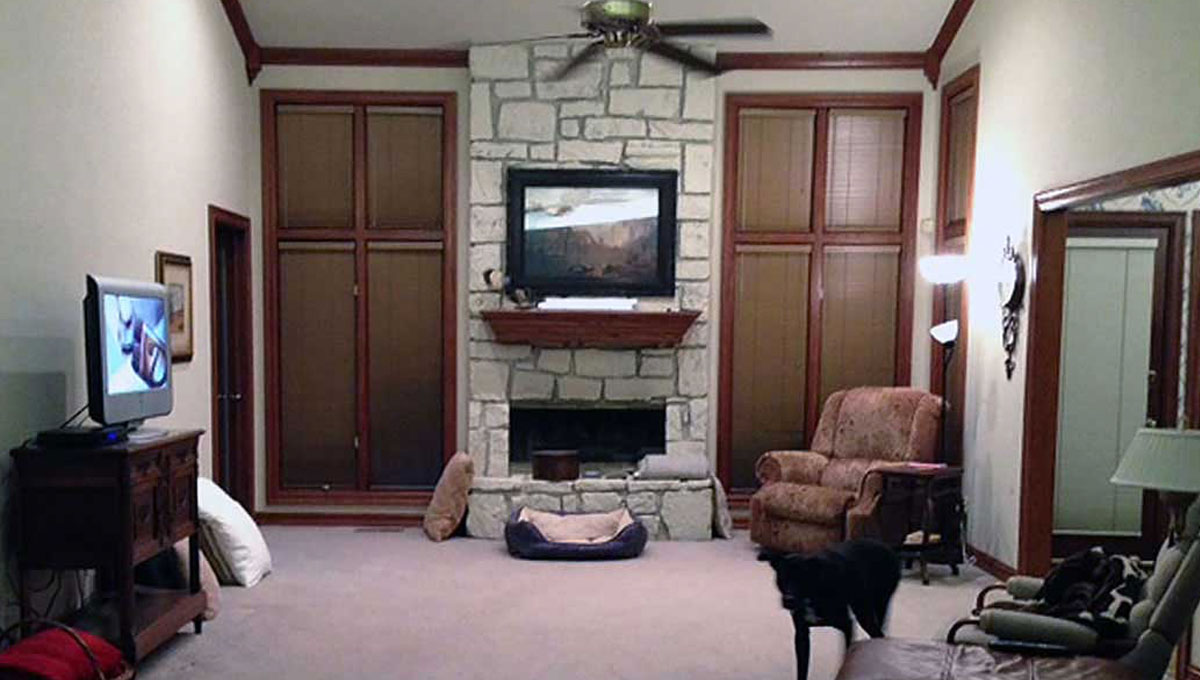
BEFORE: Cold and Uninviting
A painted sandstone fireplace with disproportionately squat firebox were the dominant features in this family room. Inefficient casement windows outfitted with surface mounted mini blinds gathered dust as they shielded the carpeted floor from the sun rising to the east.
AFTER
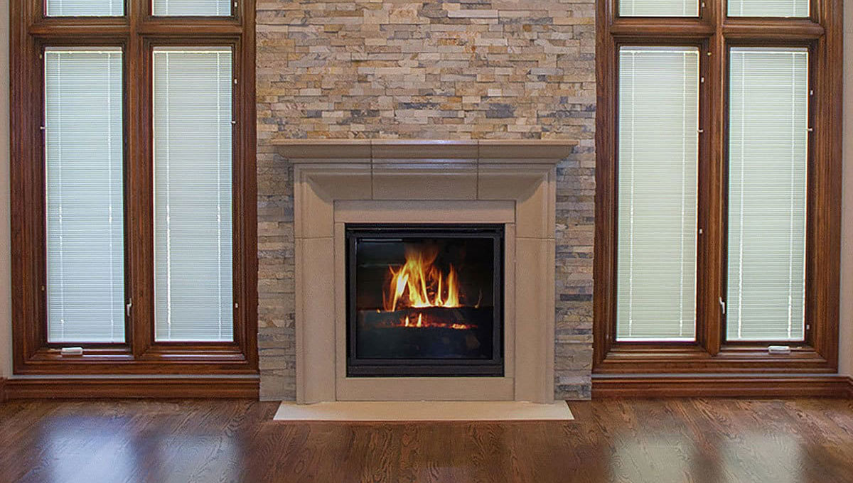
AFTER: Stunning in Slate
Pella Designer Series casement windows, outfitted with interior mini blinds, were installed for comfort and convenience. A cast concrete fireplace mantle and surround with a linen finish, custom manufactured by Solus Fireplaces embraces a Napoleon HD35 fireplace insert. Complete with a remote-controlled flame it provides a romantic setting in the room. A ten-foot-tall wall of split slate from Emser Tile & Stone adds both beauty and visual interest.
BEFORE
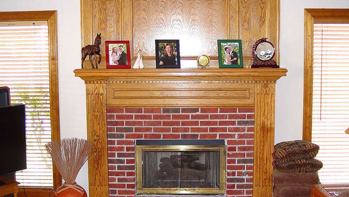
BEFORE: Pretty Basic
A brick covered fireplace surround with oak fireplace mantle and legs were the focal point in this family room. Surrounded by twin aluminum casement windows, it had no visual interest. An eight-foot-high ceiling limited the comfort level in the room. It along with a worn carpet and pad called out for change in this room.
AFTER: Laid-Back & Posh
The existing fireplace surround was removed and furred out to give added dimension to the fireplace surround. It was then covered with a Cross Cut Travertine Tile from Visions Tile & Stone. The ceiling was raised to ten feet with a double French Vault taking advantage of available attic space above. Pella Architectural fixed clear view windows were added for additional light. An oak hardwood floor and custom furniture completed the transformation.
BEFORE
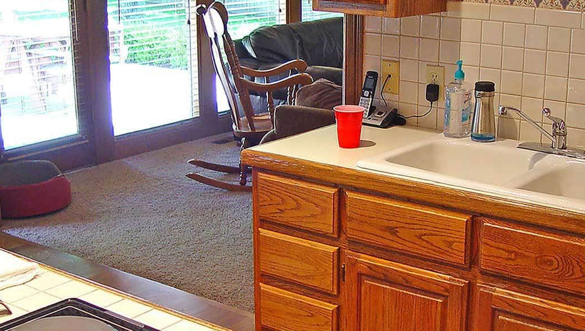
BEFORE: Cluttered & Cramped
A small center island in this kitchen had little utility while it encumbered traffic flow during meal preparation. Oak cabinets with visible hinges dated this home to the late 80s. Laminate countertops and four-inch tile on the backsplash completed the 80s picture. A combination of carpet, wood flooring and walls defined individual rooms in this home.
AFTER: Family Friendly
The kitchen was opened to the family room by removing a load bearing wall. An abundance of seating space was created with Alaska White granite overhangs on two sides of the kitchen cabinets. A strong focal point was created by renovating the fireplace with a Cross Cut Travertine face. New hardwood floors now run throughout the first level, unitizing the family room, kitchen, and adjoining library.
Share your vision with us.
The experts at The Buckingham Group are here to create a home that’s as extraordinary as you are.
Any project, any style, any dream, bring your inspiration to The Buckingham Group.
Schedule your personalized complimentary appointment today.
PORTFOLIOS
RESOURCES
The Buckingham Group | 4727 S. Memorial Drive | Tulsa, OK 74145 | 918-624-2666

